
Angular Inputs - Improved Error UX
Here's an elegant way to see whether your input is in focus or not and how you can use that in the HTML template to trigger styling or other changes.


Recently I was building out a login form and I thought, it would be great if the input would show that there is an error as soon as you leave it as you traverse through the form.
That's easy right? In a way yes, in a way no. It's quite easy to implement that kind of functionality, but it's difficult to polish it up to make the error only show when you leave the input. The reason for this is because you need to know when the input is in focus, and that functionality is not available in Angular by default - you have to make a directive.
Let's start with adding validators to our input and then binding whether or not it's valid into the error field on the component, when this is set to true, it highlights the input in red. Here's an example of my code:
And here's what it looks like on the app:
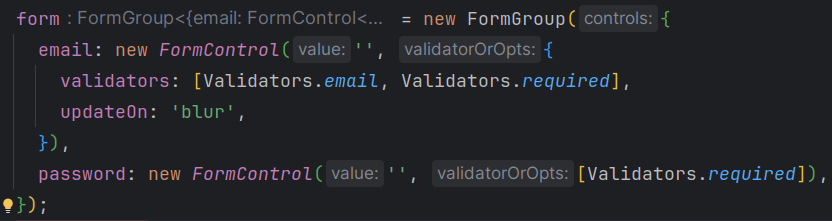
So that's okay, but we don't really want it to trigger while you type, right? For me, I don't love the red outline while you're inputting your email, I'd prefer it goes red when you leave the input and move on to the next one. That's where people suggest that you use the updateOn key in your form control. If you set this value to blur it will only update when you leave the input.
And here's what it looks like in the app:
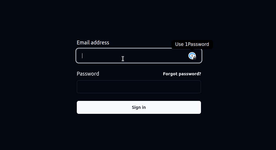
So that's a bit better, but I don't really want it to be outlined in red when the user is making the change. Rather, I want it to be red when they leave an input that is not correct and I want it to be clear when they come back into it.
The way you do this, is to look at whether the component is in focus. If it is, we'll clear all the error styling, otherwise, we'll show the user something is wrong. So you'll need to create a directive for this:
Thanks to Vova Bilyachat's StackOverflow answer for the idea, I've changed it a bit for my purposes, but this was the foundation to the answer.
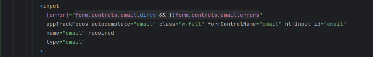
There's a really cool feature in Angular where you can create a directive and then bind to that directive in the Angular template (ie. In the HTML). What this allows you to do is use the variables from that directive in your HTML code. So here's an example of my new input:
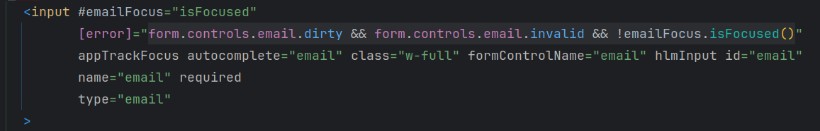
Notice that I've added #emailFocus="isFocused" to bind to the exported directive, I've added the appTrackFocus directive, and finally, I've used !emailFocus.isFocused() to keep track of whether this input is in focus.
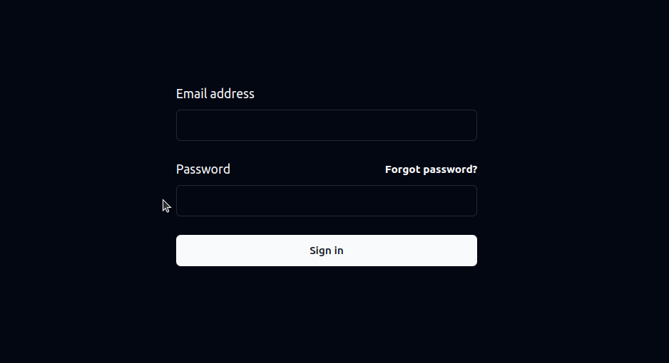
And here's how it looks in the app:

And there it is! We are now able to use the isFocused state to see whether a user is on an input. We can then use that isFocused variable in our HTML to trigger styling changes or any template changes in general.
