
Tutorial: CSS Flex Layout
Layout can be an absolute pain. I've found manually building layouts using flexbox to be quicker, more stable and more maintainable.
Introduction
Layout can be an absolute pain. Usage of CSS frameworks such as Semantic UI and Bootstrap can help a lot. But, they prescribe specific building blocks which result in very standard layouts that are difficult to modify and sometimes tricky to read. In most cases I've found manually building layouts using flexbox to be quicker, more stable and more maintainable.
Background
Without the use of flexbox (or a framework) the following CSS properties could be used to create layouts:
- Position; relative, absolute, fixed
- Display; block, inline, grid, table
- Float
Instead, we will use flexbox to achieve our common layout tasks; drastically simplifying our CSS and HTML.
What is Flexbox?
Designing with flexbox is easily achieved by creating parent-child relationships. To create a layout we need a flex container (parent). The container defines most of the layout rules. Flex items (children) may then be added to this container which are automatically positioned and sized according to siblings and the container's rules.
To create a container we set the display CSS property to flex:
.container {
	display: flex;
}
No properties need to be set on the children.
The next property to set is the flex-direction. This describes whether children will align next to each other (like columns) or on-top of each other (like rows). More later.
.container {
	display: flex;
	flex-direction: row | column;
}
Various properties may then be used to describe the positioning and behaviour of child elements:
- flex-wrap: wrap | nowrap - whether or not children will overflow onto a new line when reaching the end of the container
- justify-content: flex-start, flex-end, center, space-between, space-around, space-evenly - this property defines the alignment of children items according to the flex direction. For a row flex-direction this will determine the positioning of children on the x-axis
- align-items: flex-start, flex-end, center, baseline, stretch - this property defines the alignment of children perpendicular to the flex direction. For a row flex direction this will determine the positioning of the children on the y-axis.
There are many more options but I've found the above properties to solve most problems.
Further reading (with examples): css-tricks.com: flexbox
Examples
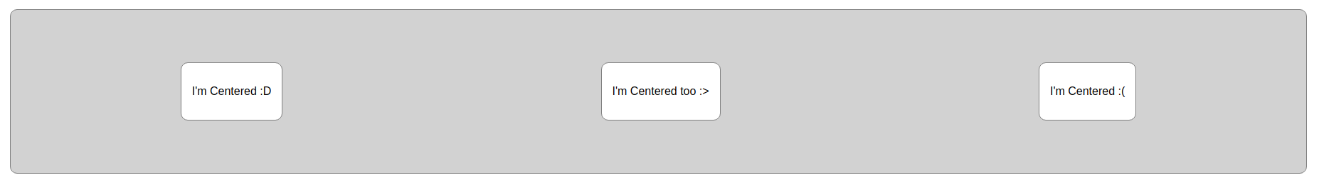
Centering
A common layout requirement is centering. This is easily achieved by creating a flex-container with a row flex-direction which justifies content in the center of the x-axis and aligns items in the center of the y-axis.
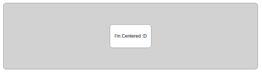
Very little HTML is required and only three lines of CSS are used to center the item (the rest is styling). Furthermore, the child requires no knowledge of its layout which means we can control child layout using the parent exclusively.
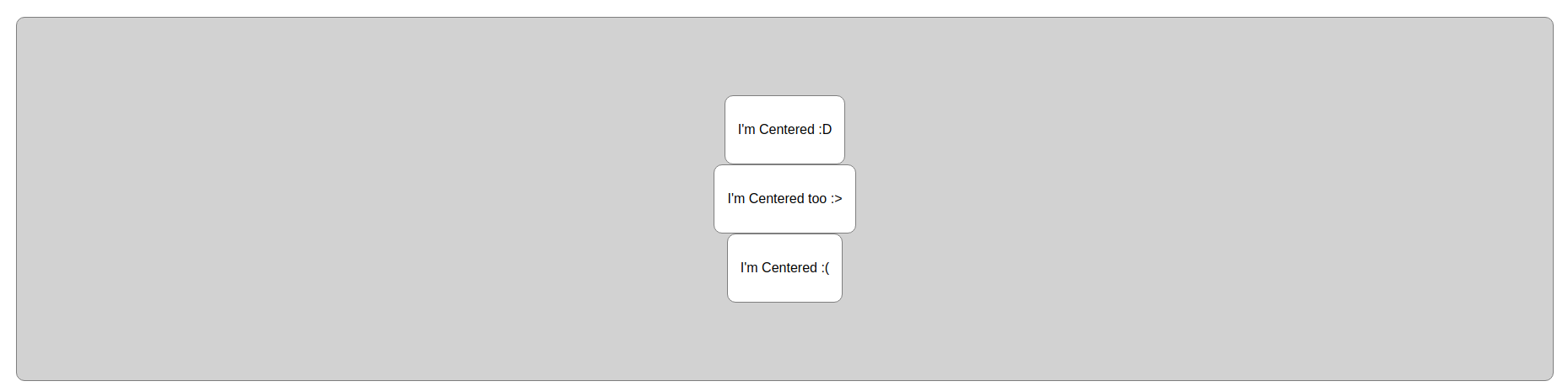
Adding multiple children works great:
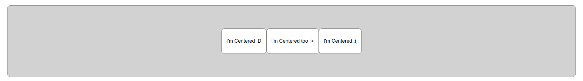
The items can be stacked on-top of each other or evenly spread across the container by changing flex-direction and/or justify-content:
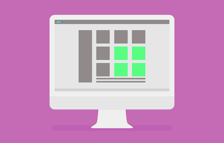
Dashboard
Another common use-case for flexbox is creating a dashboard. The nice thing about a flex based dashboard is resizable flex items (such as a collapsible sidebar) will dynamically resize the dashboard content.
For this example we want to create a dashboard with a full-height sidebar and a scrolling content view. Furthermore, we want a fixed top header within the content view.
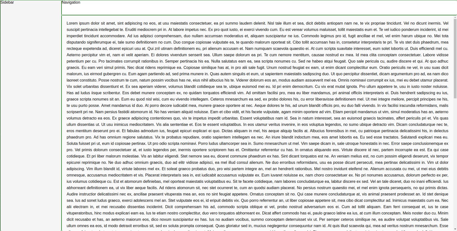
To start the HTML is structured:
The next step is to make our main-container full-height and behave as a flexbox.
The sidebar and main divs are then flex items. To make sure the content within the main div always fits the parent we also make main a flex container. Flex items may also be flex containers, this allows nested flex layouts. The main flex container has flex-direction set to column since it's flex items are arranged from top to bottom (as opposed to left to right).
The sidebar is set at a fixed width to ensure it does not grow/shrink within the container. The main flex item has a property introduced called flex-grow which means the item will stretch to fill the remaining space in the container.
The resulting scss:
Conclusion
Flexbox is an easy to use tool that drastically improves layouts and results in readable and maintainable code.
